
AP
Below are various projects.

Rhythm, Charoenkrung Pavillion
We wanted to create more awareness for this prime real estate location through pushing the benefits of this unique gated community, a community which is a good fit for all generations.
Service
Communications
Year
2019


The overarching campaign idea was “Closer to being me”. This concept illustrated that this is a place, similar to a gated community, where one can live without compromise. One can complete both their ‘needs’ and ‘wants’ here because of how close everything is.


LiveMORE
Asian Property Development was to reiterate their brand personality of AP with the campaign idea of “Live More”. The interpretation of this concept is to make more of your life by choosing and residing in a place that makes living happier.
Service
Communications
Year
2014


Galerie
A launch for a high-end condominium in Bangkok’s prime real estate area / Sukhumvit was called Galerie. The campaign idea was “Living with Art”. Our work was developed under this idea for sales brochure and OOH e.g. billboards and light boxes and print advertising for magazines.
Service
Launch Communications
Year
2015


Rhythm Asoke
AP planned on launching a new real estate project in Sukhumvit area called RHYTHM Asoke. The campaign idea was “Revive Yourself”. The visual show energy through the gestures and activities. The color is filled with energy and the lighting incorporated the use of sun flare with higher contrast.
Service
Brochure Design
Year
2016


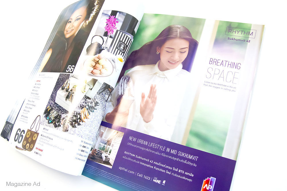
Rhythm Sukhumvit
AP planned on launching new real estate project in Sukhumvit area called RHYTHM Sukhumvit 42. The campaign idea was “Breathing Space Oxygena”. The idea was executed through the visual that show the gesture of breathing, softer more subtle contrast. The use of colour combine the Rhythm signature colour, purple with green to communicate freshness, through out the visual and the layout.
Service
Brochure Design
Year
2016


Life Asoke
AP planned on launching new real estate project in Asoke Area called LIFE ASOKE. The campaign idea was “The Sense of Time”. Visual show the sense of time by sectioning and changing in a single visual. The lighting of the visual change according to time through out the brochure so as the copy, morning to night.
Service
Brochure Design
Year
2017


Rhythm Rangnam
AP planned on launching a new real estate project in Rangnam area called RHYTHM Rangnam. The campaign idea was “Different Angle”. The ideas were executed by the unconventional manipulation of visuals combining with the binding. The visual was integrated in to the layout in a seamless way, breaking away from the traditional design.
Service
Brochure Design
Year
2017


